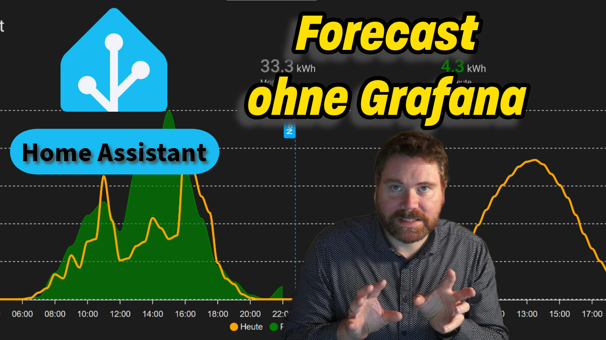
Home Assistant: Die Zukunft enthüllen: Prognosedaten ohne Grafana visualisieren!
Du hast dich vielleicht auch schon gefragt, wie du Forecast Daten auslesen kannst und diese
5 „Gefällt mir“
Timo
19. Januar 2025 um 11:41
2
Hallo
Habe die Apex Karte im Einsatz. Bei mir ist die nur so schmal höhe kann ich ja einstellen.
Gruß Timo
müsste doch über die columuns (layout) funktionieren.
grid_options:
  columns: full
  rows: auto
oder mit beliebigen Zahlen
grid_options:
  columns: 9
  rows: 3
1 „Gefällt mir“
Timo
19. Januar 2025 um 14:28
4
die Apex card hat nur yaml
wo müsste das dann hin ?
type: custom:apexcharts-card
experimental:
  color_threshold: true
all_series_config:
  unit: Cent/kWh
apex_config:
  grid:
    show: true
    borderColor: "#E0E0E0"
  chart:
    height: 300px
  tooltip:
    enabled: true
    followCursor: false
    x:
      show: false
    fixed:
      enabled: true
header:
  show: true
  title: Strompreis
  show_states: true
  colorize_states: true
  standard_format: false
graph_span: 48h
now:
  show: true
  color: 9E9E9E
span:
  start: day
series:
  - entity: sensor.tibber_prices
    name: Preis
    show:
      in_header: before_now
      name_in_header: false
    color_threshold:
      - value: 0
        color: 4DD0E1
      - value: 10
        color: 26A69A
      - value: 15
        color: 4CAF50
      - value: 20
        color: 7CB342
      - value: 25
        color: FBC02D
      - value: 30
        color: EF6C00
      - value: 40
        color: B71C1C
    type: line
    curve: stepline
    extend_to: false
    stroke_width: 2
    float_precision: 3
    data_generator: |
      const noon = new Date()
      noon.setHours(0, 0, 0, 0)
      const prices = entity.attributes.today.concat(entity.attributes.tomorrow);
      const data = [];
      for(let i = 0; i < prices.length; i++) {
        data.push([noon.getTime() + i * 1000 * 3600, prices[i].total * 100])
      }
      return data;
height ist die höher sollte da nicht die breite dabei ?
ich habe es bei anderen Karten die nur per Yaml konfiguriert werden einfach ans Ende gepackt. So wie @jayjojayson den Code gepostet hat.
Ja genau, einfach am Ende einfügen. Ohne Leerzeilen davor.
Timo
19. Januar 2025 um 15:18
7
type: custom:apexcharts-card
experimental:
color_threshold: true
all_series_config:
unit: Cent/kWh
apex_config:
grid:
show: true
borderColor: "#E0E0E0"
chart:
height: 300px
tooltip:
enabled: true
followCursor: false
x:
show: false
fixed:
enabled: true
header:
show: true
title: Strompreis
show_states: true
colorize_states: true
standard_format: false
graph_span: 48h
now:
show: true
color: 9E9E9E
span:
start: day
series:
- entity: sensor.tibber_prices
name: Preis
show:
in_header: before_now
name_in_header: false
color_threshold:
- value: 0
color: 4DD0E1
- value: 10
color: 26A69A
- value: 15
color: 4CAF50
- value: 20
color: 7CB342
- value: 25
color: FBC02D
- value: 30
color: EF6C00
- value: 40
color: B71C1C
type: line
curve: stepline
extend_to: false
stroke_width: 2
float_precision: 3
data_generator: |
const noon = new Date()
noon.setHours(0, 0, 0, 0)
const prices = entity.attributes.today.concat(entity.attributes.tomorrow);
const data = [];
for(let i = 0; i < prices.length; i++) {
data.push([noon.getTime() + i * 1000 * 3600, prices[i].total * 100])
}
return data;
grid_options:
  columns: 9
  rows: 3
nö geht nicht kommt fehler